Posts Tagged ‘modern art’
Two of my favorites…
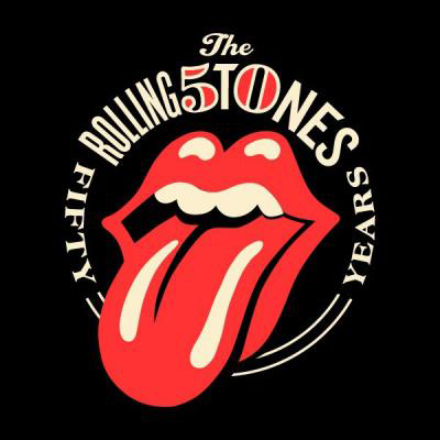
Shepard Fairey does the Rolling Stones’ 50th Anniversary logo…and it’s awesome.
I first saw Shepard Fairey’s work at the IFC in Boston several years ago and was blown away. I’m generally not a fan of modern art and tend to prefer the classic impressionist and Renaissance artists, but I love a political uproar. 😉 I remember his work being über controversial at the time. Very 1984-esque, I love it!
The Rolling Stones, a favorite from an early age many thanks to my dad, made a wise choice in selecting Fairey to do their art work. I love the vintage-y look of the red color of the tongue. Very reminiscent of a lot of Fairey’s work that was exhibited at the IFC.
I never would have imagined the two collaborating but it’s absolutely genius. I think you can really grasp the connection the two artists have as well. They both are heavily attracted to rebellion, naturally, I adore them.
I grabbed the image and Fairey’s response to the design work (below) from Rolling Stone magazine. I love that Fairey too was introduced to the Stones by his father…
“I’ve been a big fan of the Rolling Stones since my dad introduced me to “Satisfaction.” Tattoo You is one of the earliest albums I bought with my own money and I studied the album package obsessively … you may notice how its color scheme and iconic art could have inspired me? The Rolling Stones have had a lot of great art over the decades, but nothing can top their tongue logo, originally created by John Pasche in 1971. In my opinion, the Stones’ tongue logo is the most iconic, potent and enduring logo in rock & roll history. I think the logo not only captures Mick Jagger’s signature lips and tongue, but also the essence of rebellion and sexuality that is the allure of all rock & roll at its finest.
I first worked with Mick Jagger and Dave Stewart on their project SuperHeavy. Mick and Dave were great to work with and I became at ease with our creative rapport despite their stature as musicians. However, when Mick Jagger reached out to me about designing a logo to mark the Rolling Stones’ 50th anniversary I was quite overwhelmed. Mick said he was open to any of my ideas. One of the first things I asked Mick was, “Don’t you think the tongue HAS to be included?” He responded, “Yeah, I guess it ought to be.” Case closed. I was very humbled and honored to be asked to work on the 50th logo, so my objective was to service and showcase the Stones’ legacy rather than try to make my contribution dominant.
I worked on this project as a fan knowing that the Stones’ tongue was the focus and the starting point. With that in mind I set out to integrate the 50 in a creative and memorable way. I think the solution speaks for itself in celebrating the Stones’ trademark icon and historical anniversary. I’d like to thank the Rolling Stones for all their great music that has impacted my life and for allowing me to make a small contribution to their 50th anniversary.
Cheers!” ~Rolling Stone magazine
